Product Description
Sweet Crust Bakery is a locally owned artisan bakery renowned for its delightful range of bread, pastries, and desserts. The bakery values sustainability, sourcing ingredients from local farmers and reducing waste whenever possible. It’s well-known and loved by many local customers.
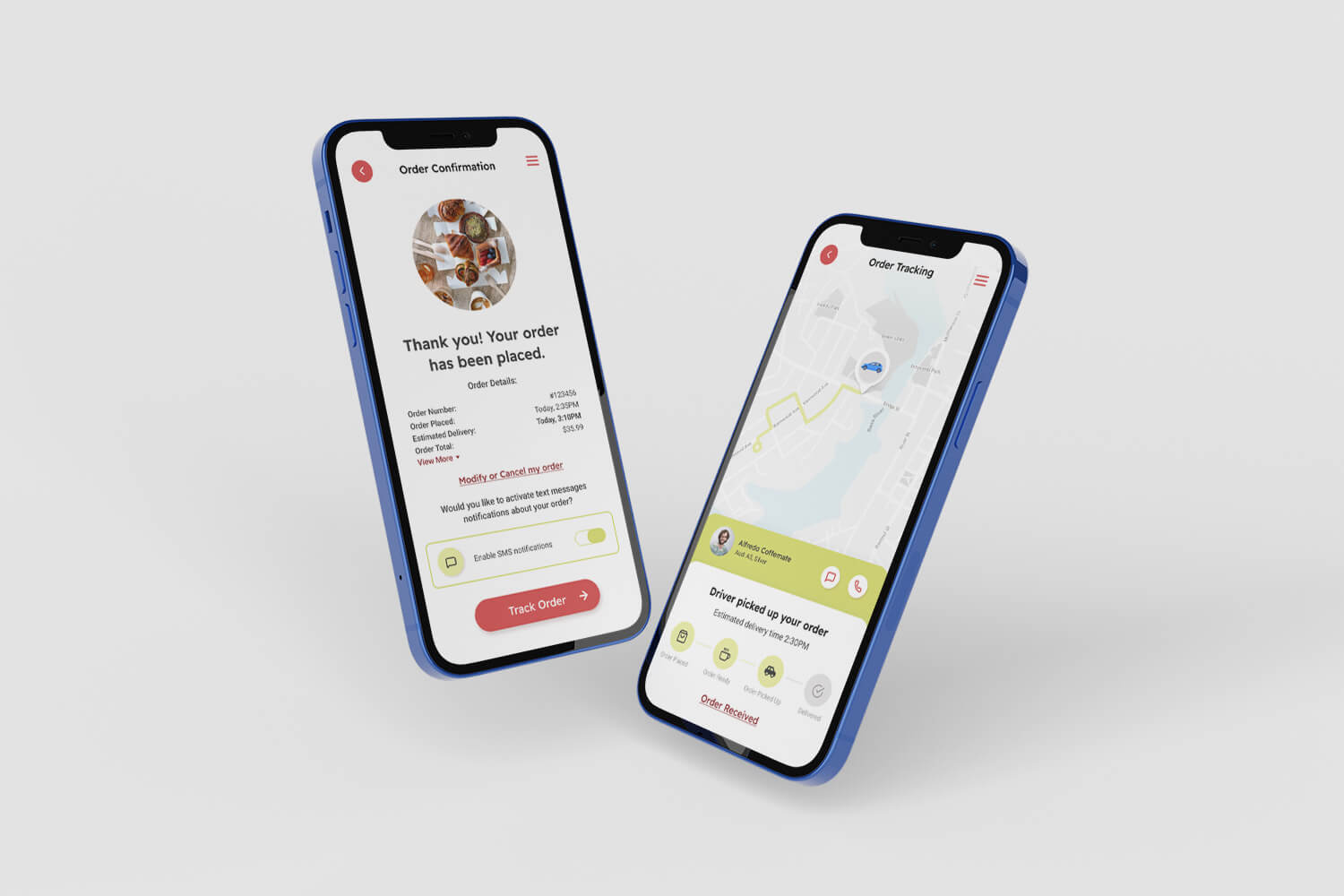
Sweet Crust Bakery has a functional app for its customers to place orders, but it lacks a key feature – delivery tracking. This absence became a challenge, as customers were left uncertain about the status of their orders and the estimated delivery times, leading to a higher volume of customer service inquiries and overall anxiety. The need to enhance user experience and improve customer satisfaction led to me undertaking this project, with the aim to design an intuitive and user-friendly delivery tracking feature for the Sweet Crust Bakery app.
My Role
UX Designer
Project Duration
Feb 2023 – June 2023
Scope of Work
User research
Personas
Problem statements
User journey maps
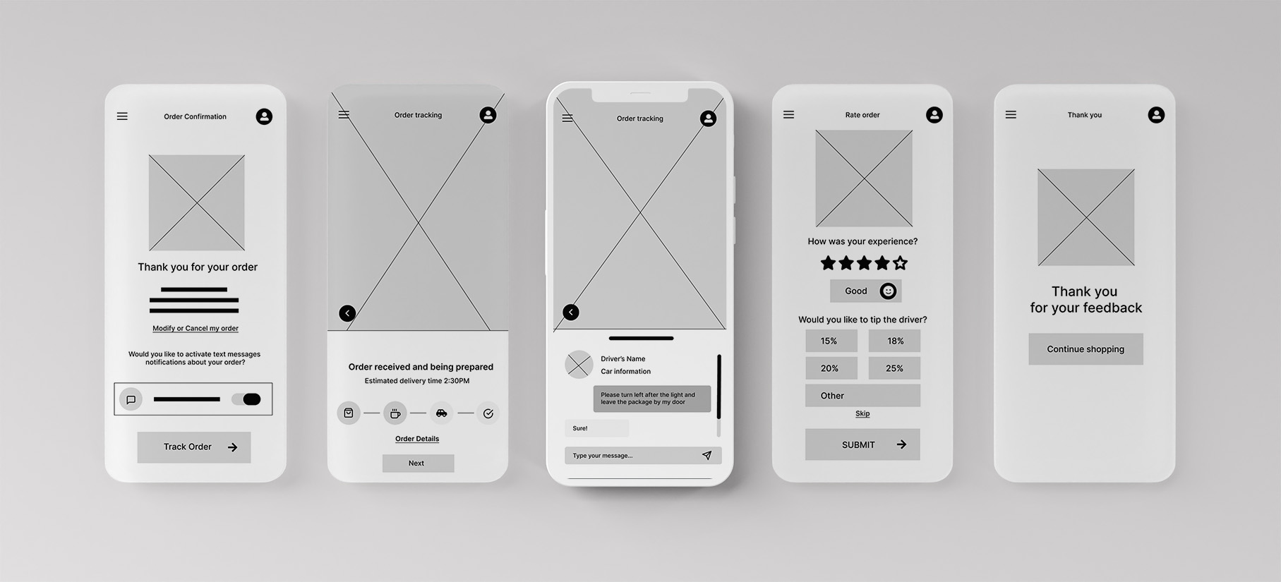
Digital wireframes
Low-fidelity prototype
Usability studies
Mockups
High-fidelity prototype
Accessibility
Problem
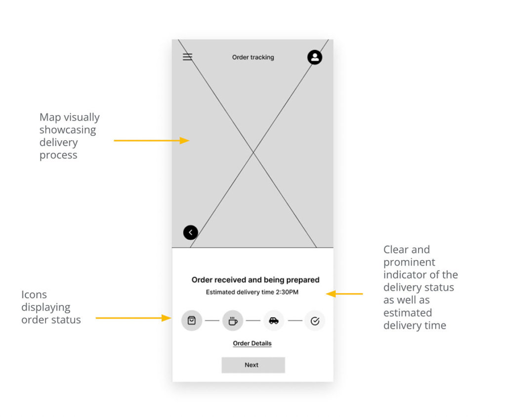
Provide a user-friendly and intuitive interface that enables users to easily track the status of their orders. The interface should provide clear and concise information about the order status, such as whether the order has been received, prepared, shipped, or delivered, and the estimated delivery time.
Goal
To create a user-friendly and intuitive interface that simplifies the order tracking process provides clear and concise information about the status of the user’s orders, and enables users to easily modify, cancel, or provide feedback about their orders, thereby enhancing the overall user experience, increasing customer satisfaction, and improving customer loyalty.
Tools Used
Mural
Otter AI
Illustrator
UserTesting.com
Figma
UNDERSTANDING THE USER
User Research: Summary
I conducted user interviews and created empathy maps to understand the users I’m designing for and their needs. A primary user group identified through research was busy individuals who may not have the time or ability to visit the bakery during business hours but still want to enjoy fresh baked goods.
This user group confirmed initial assumptions about the app, but research also revealed that time was not the only factor limiting users from picking up bakery goods at the location. Other user problems included obligations, disabilities, interests, or challenges that make it difficult to go to the bakery shop in person.
User's Pain Points
Lack of Real-Time Updates
Customers often face difficulties due to the absence of real-time tracking, which could leave them uncertain about their delivery’s exact location and status.
Inaccurate Estimated Delivery Time
If the estimated delivery time isn’t accurate, it can disrupt customers’ plans, especially if they’re organizing their schedule around the delivery or have other commitments.
Unclear Communication
Without clear notifications about each step of the delivery process (e.g., order prepared, out for delivery, etc.), customers can feel out of the loop, leading to unease and dissatisfaction.
Difficulty in Contacting Support or Delivery Person
If there are issues during the delivery process or if customers have specific delivery instructions, the inability to easily contact the delivery person or customer support can be a significant pain point.
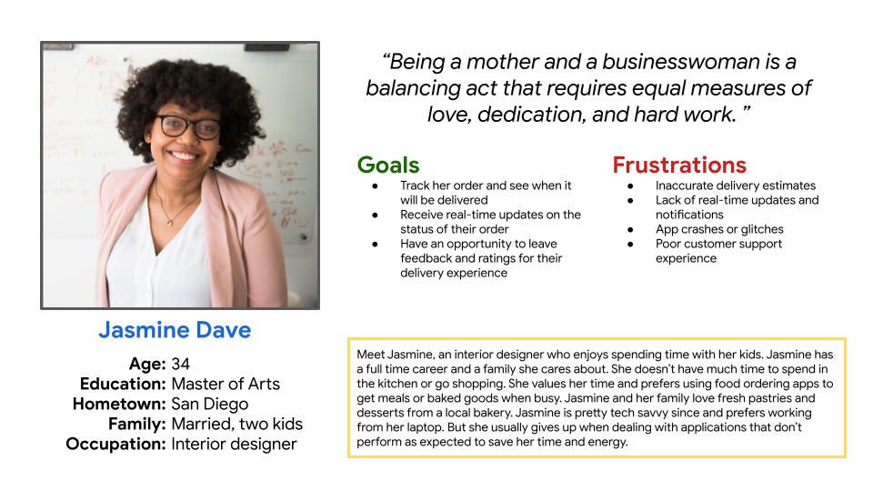
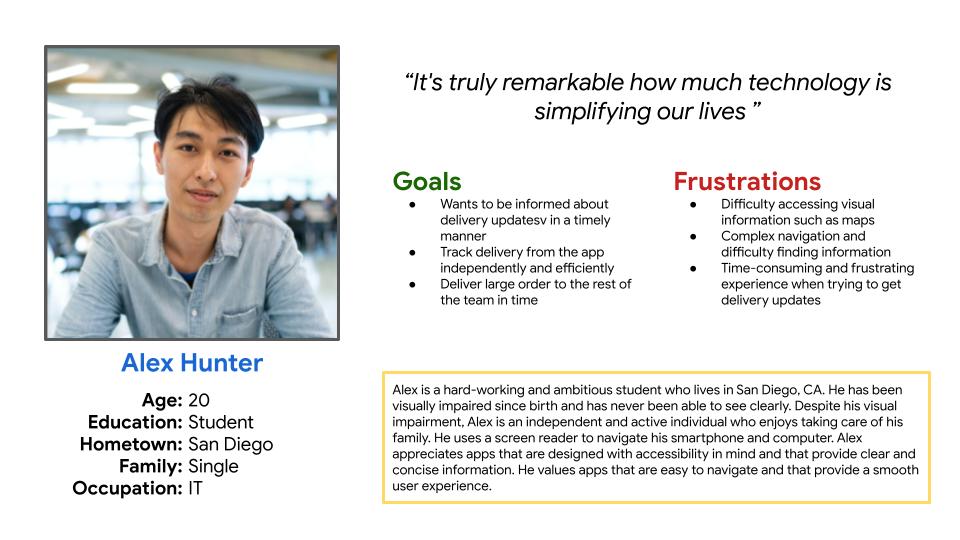
User Personas
Creating user personas is a fundamental step in understanding the needs, behaviors, and goals of our target audience.
User journey map
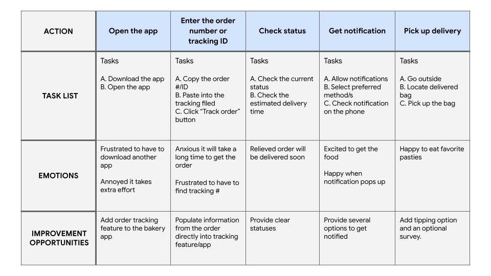
I aimed to pinpoint the issues that users face while tracking their orders, like uncertain delivery times, trouble modifying or canceling their orders, and inadequate communication. My objective was to comprehend how users engage with the order tracking feature and what they anticipate from it.
STARTING THE DESIGN
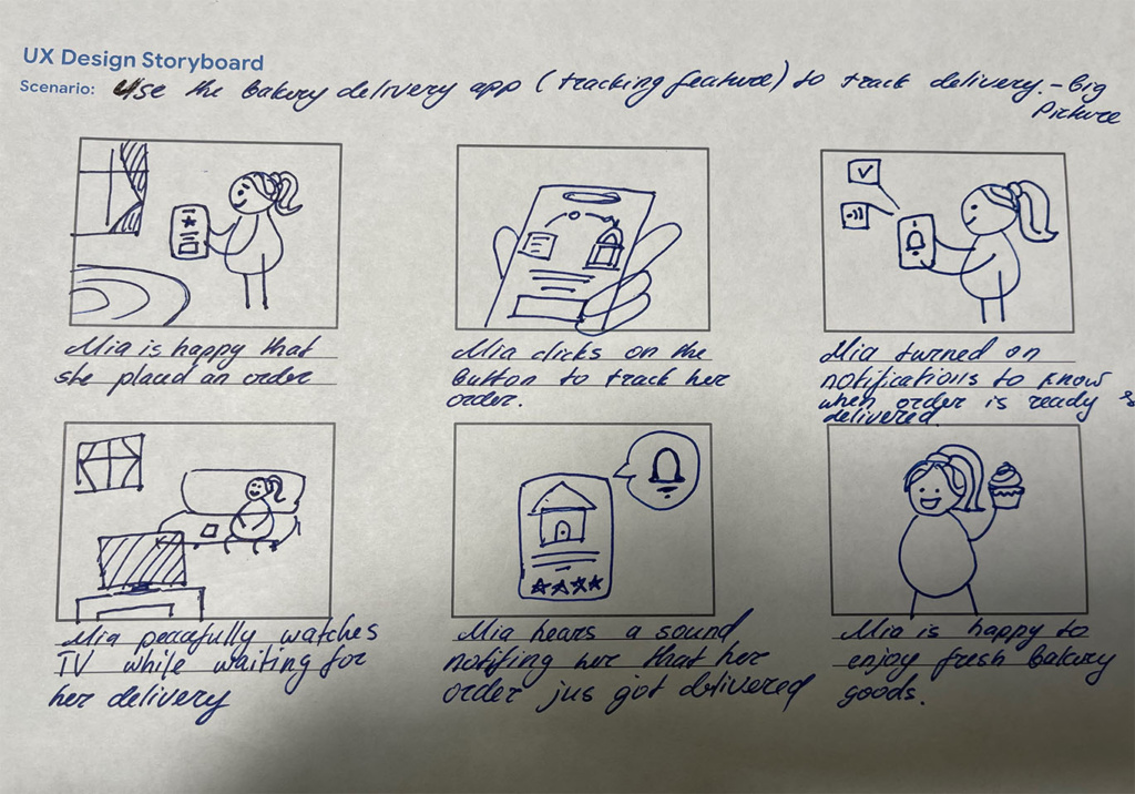
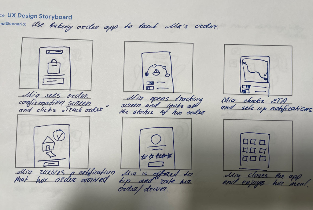
Storyboards
By mapping out the steps that the user takes and the interactions they have with the product or service, I was able to gain a clearer understanding of their needs and preferences. This allowed me to make more informed decisions about how to improve the user experience and create a product that meets their needs more effectively.
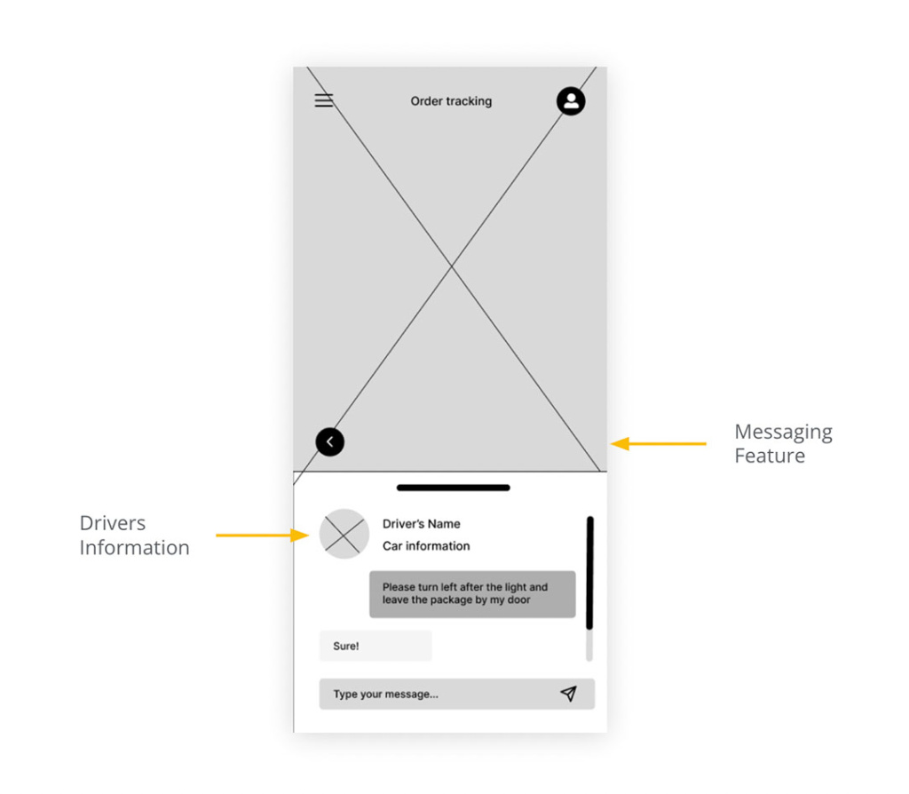
Digital Wireframes
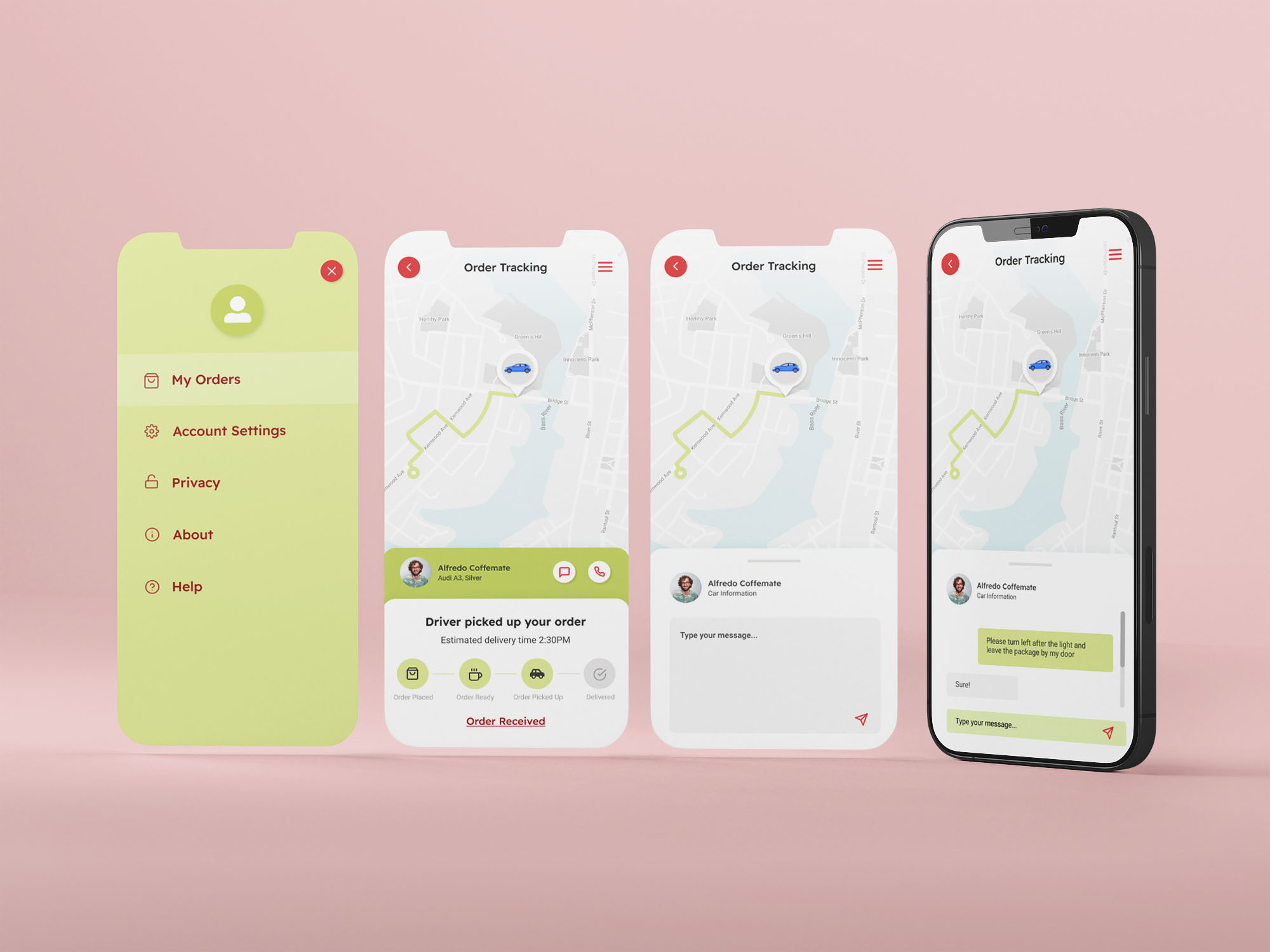
Based on user research, having a messaging system to contact the driver is important for a number of reasons. First, it enables users to get in touch with the driver quickly and easily, which can be especially important if there are unexpected delays or changes to the delivery. Second, it provides users with a sense of control and peace of mind, as they can get updates and information about their delivery in real-time.
Low-fidelity prototype
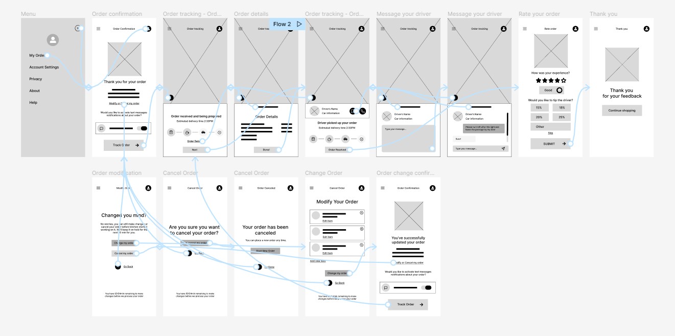
The low-fidelity prototype connected the primary user flow of tracking the order, so the prototype could be used in a usability study with users.
Usability study - wireframes
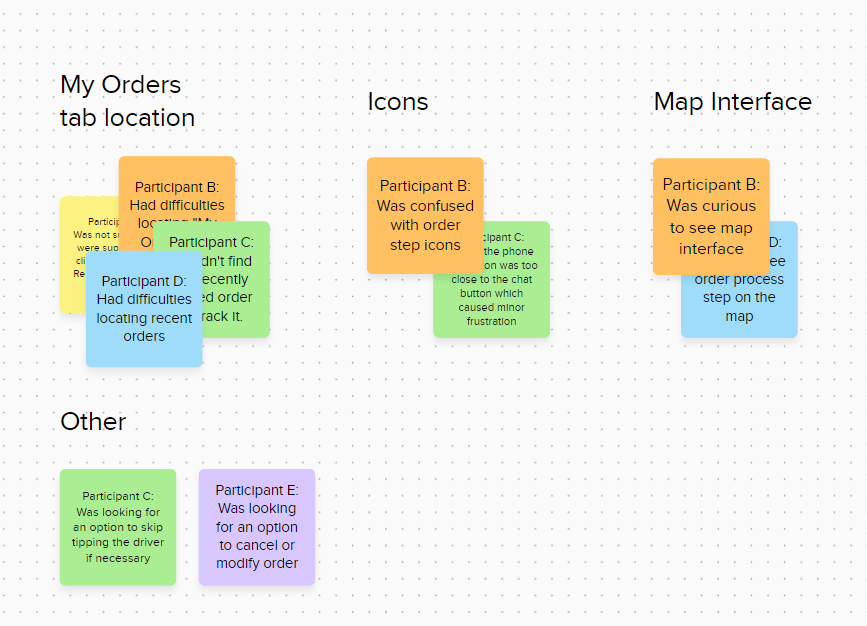
Following the creation of our initial wireframe drafts, I moved on to conduct comprehensive usability studies. These tests served as an essential tool for gauging user interaction with my design, allowing me to capture valuable insights into the intuitiveness, efficiency, and overall user satisfaction of my delivery tracking feature before moving on to the high-fidelity prototype.
Findings
- Users need better cues to locate the “Orders” tab
- Users might need additional ways to identify the exact meaning of the app’s icons.
- Users need more options available when it comes to tipping.
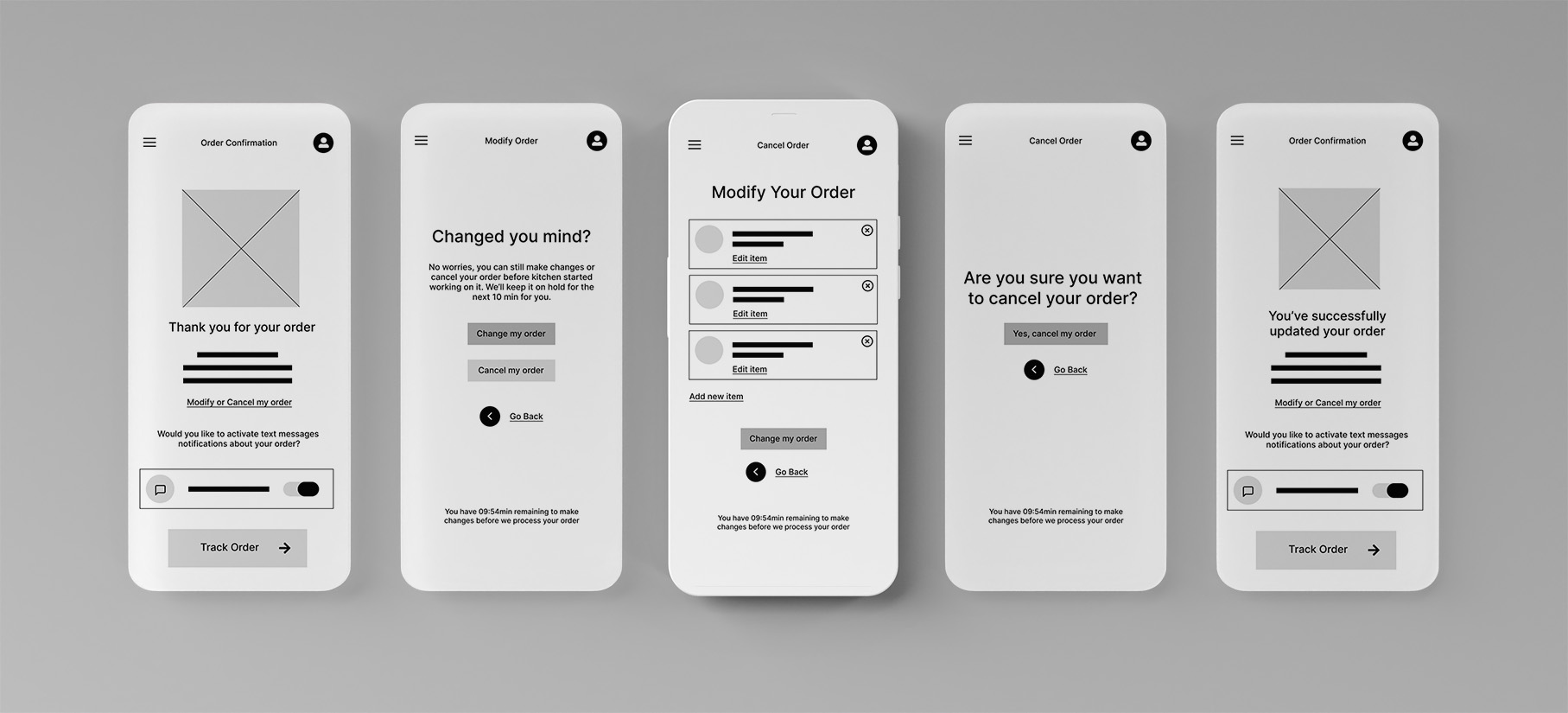
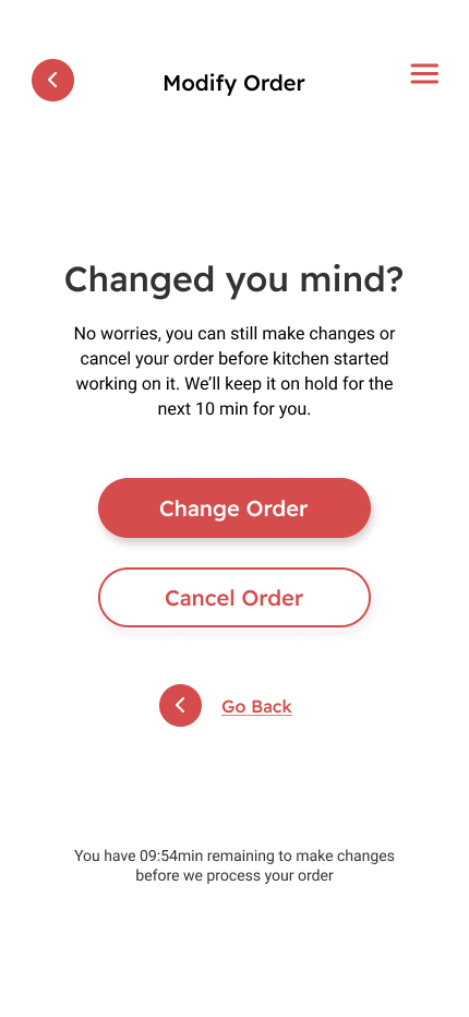
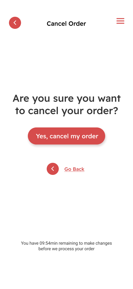
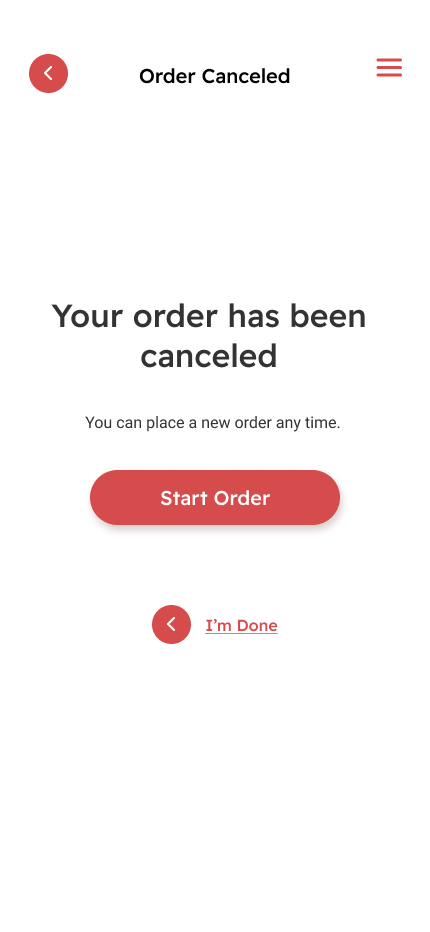
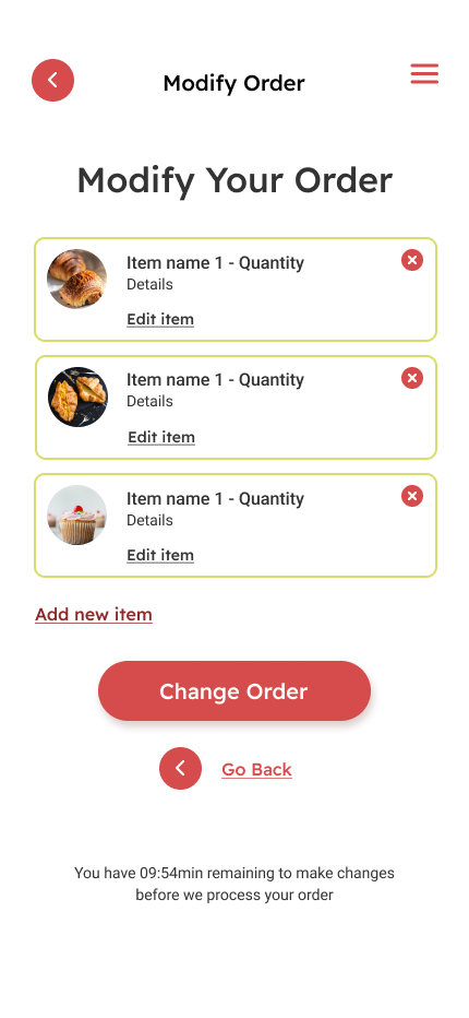
- Design should consider order modification and cancellation options.
- Map experience should be included in the next prototype version.
Wireframe Updates
Following the results of usability studies, I’ve decided to update my wireframes.
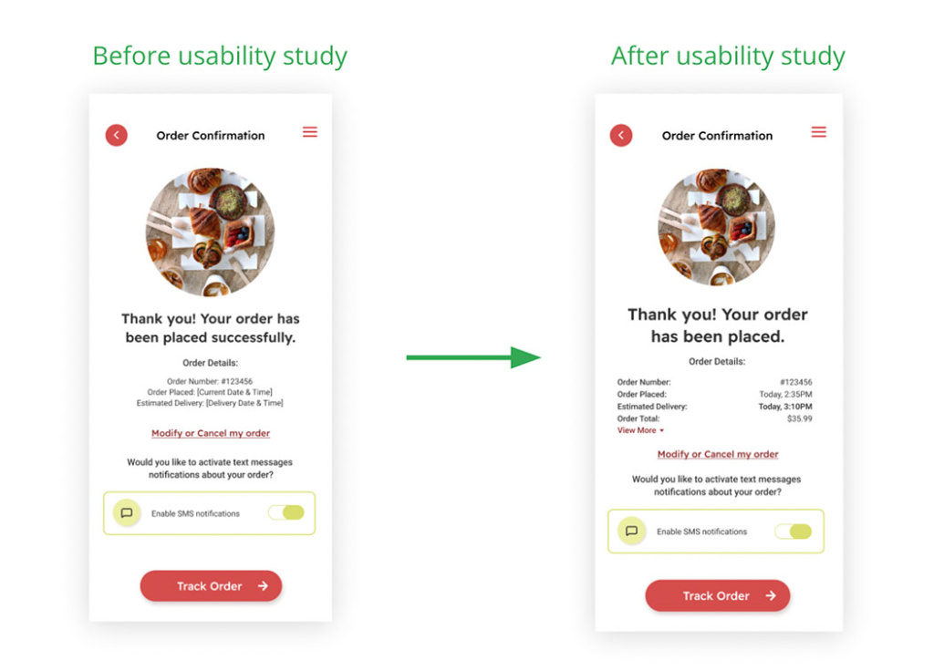
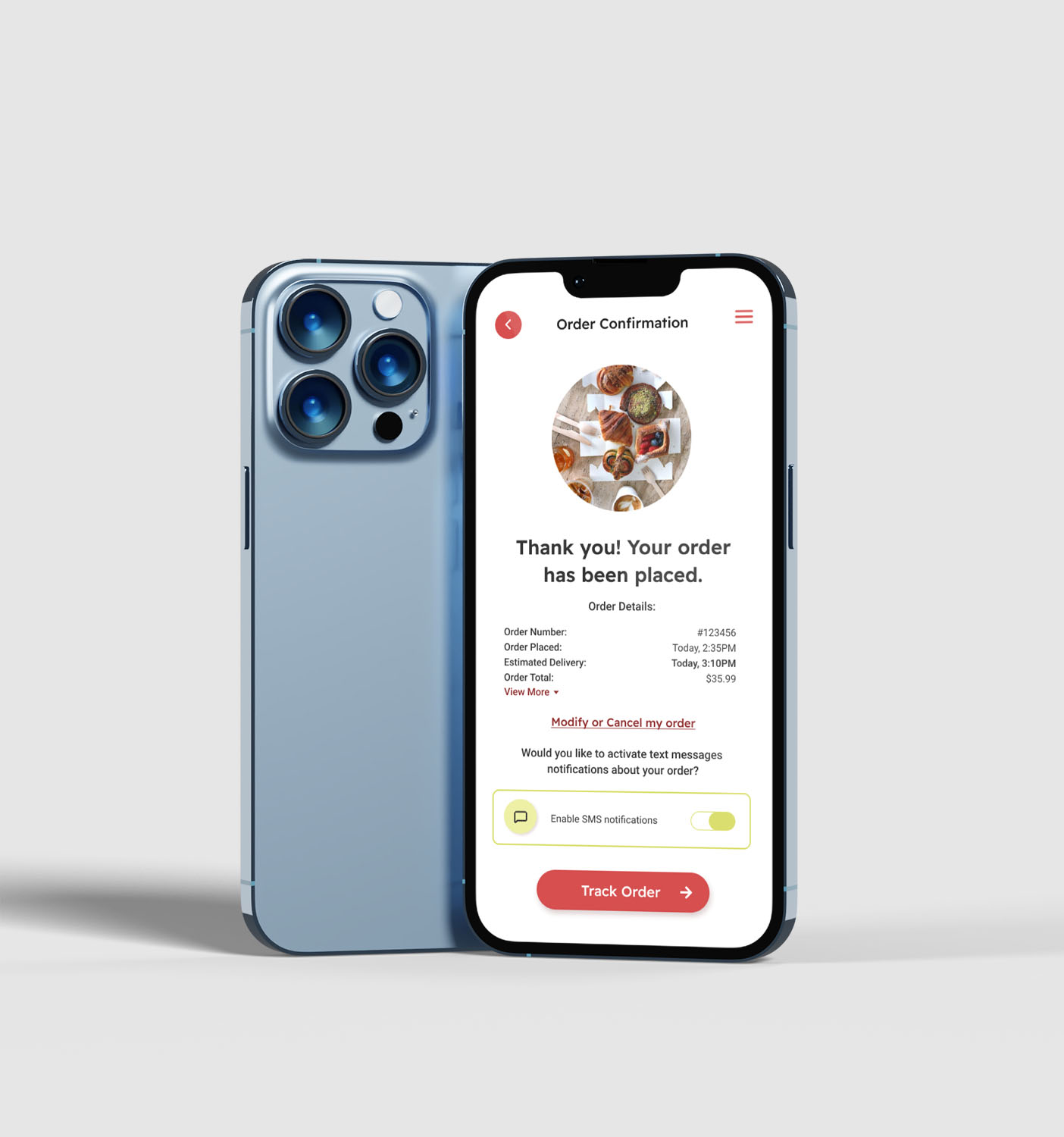
The addition of a modify/cancel order feature to the order confirmation screen would enhance the user experience by providing them with the ability to make changes to their order.
Updated Low-fidelity prototype
Additional Research Recommendations
Conducting usability testing with a larger sample size of users to ensure that the design changes made have improved user experience.
Gathering feedback from stakeholders, such as customer service representatives or sales teams, to assess the impact of the design changes on their workflow and productivity.
Conducting a comparative analysis of the updated design against similar products in the market to identify areas for improvement and differentiation.
Usability study - hight fidelity mockups
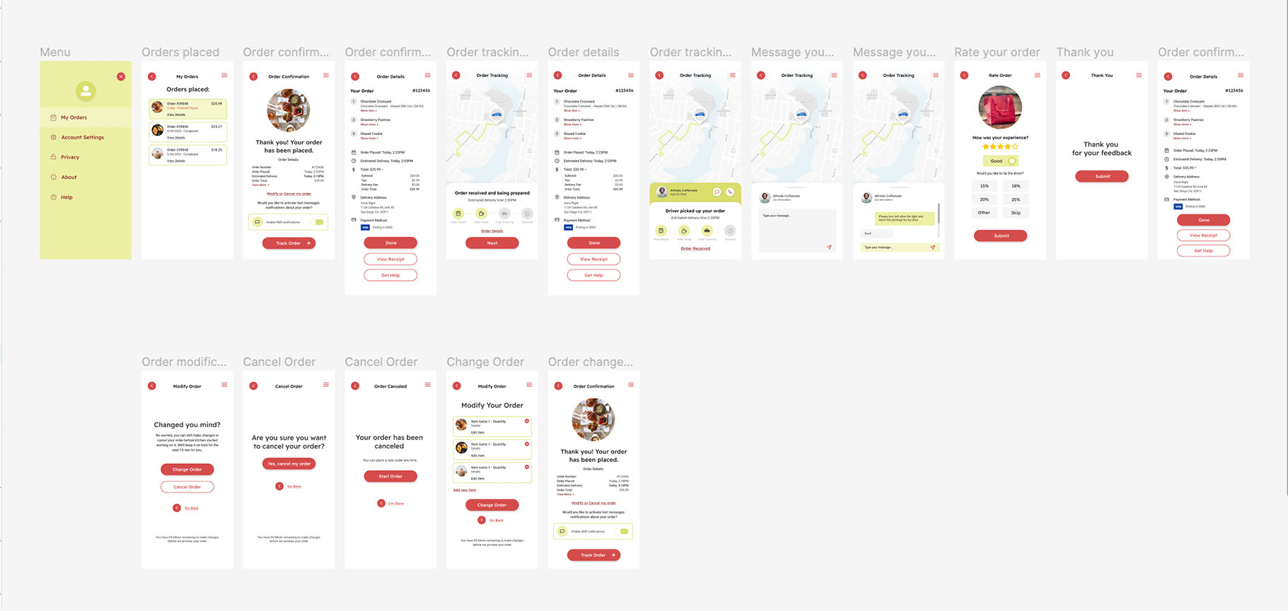
In updating the high-fidelity mockups after the usability study, my goal was to enhance the user experience by making necessary adjustments based on the feedback received. The addition of a “View More” option below the order details section aims to provide users with easy access to more detailed information, thereby promoting user engagement and simplifying the ordering process.
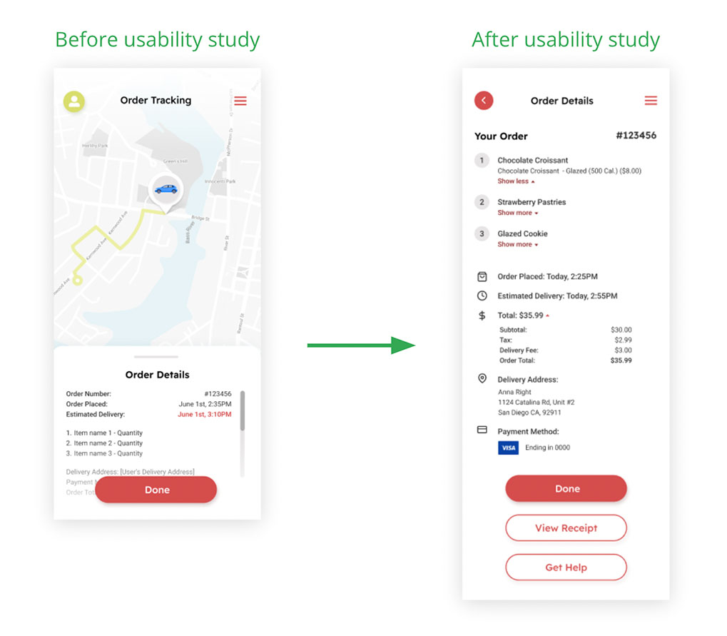
In the next phase of the design process, I dedicated an entire screen to the Order Details section to provide a comprehensive, yet clear and organized view of all the necessary information. This design evolution focused on enhancing user convenience by eliminating the need for excessive scrolling or navigation, thus ensuring every pertinent detail regarding the user’s order is readily accessible in one clean, intuitive interface.
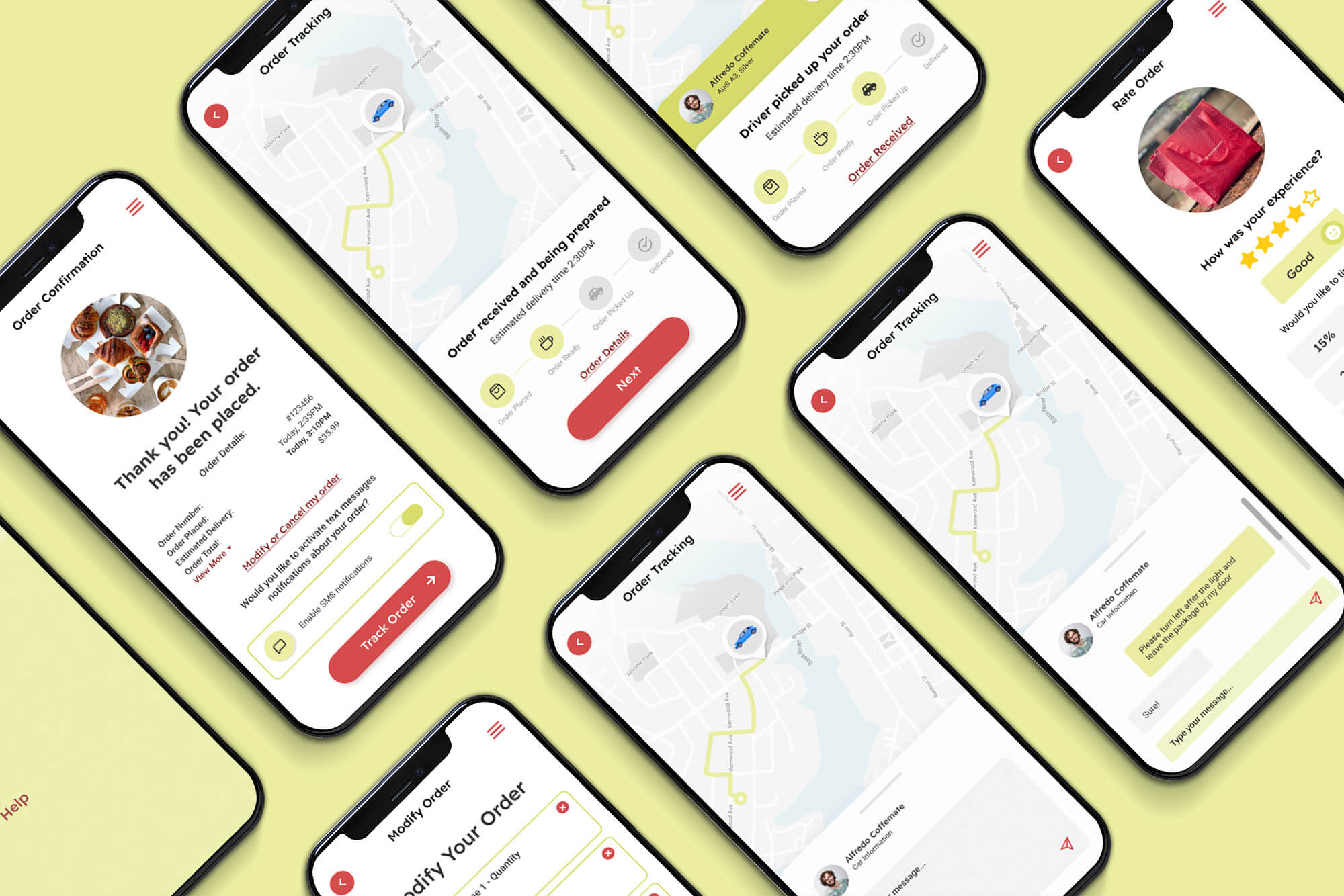
final design
Order Confirmation
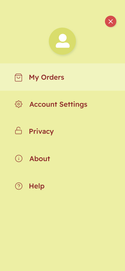
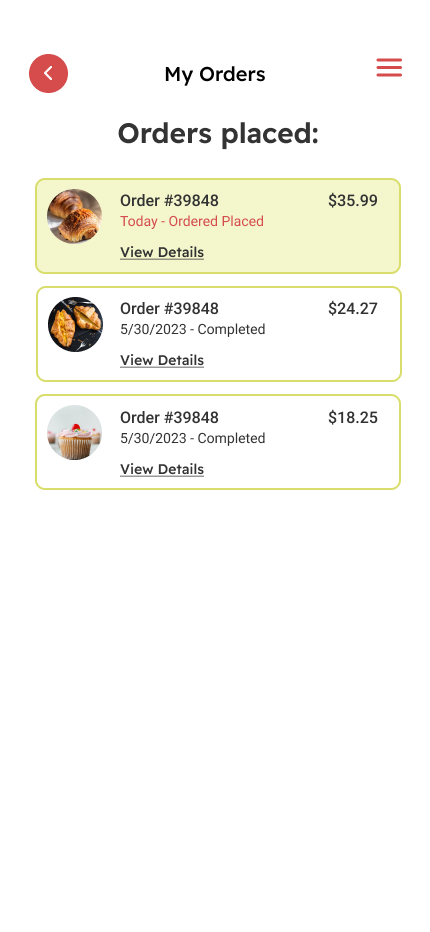
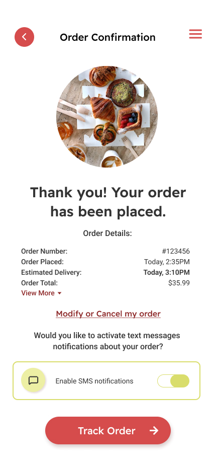
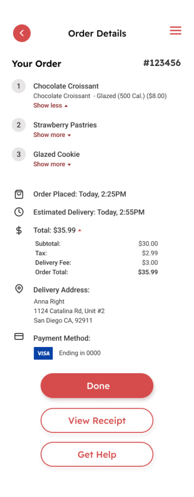
Order Tracking
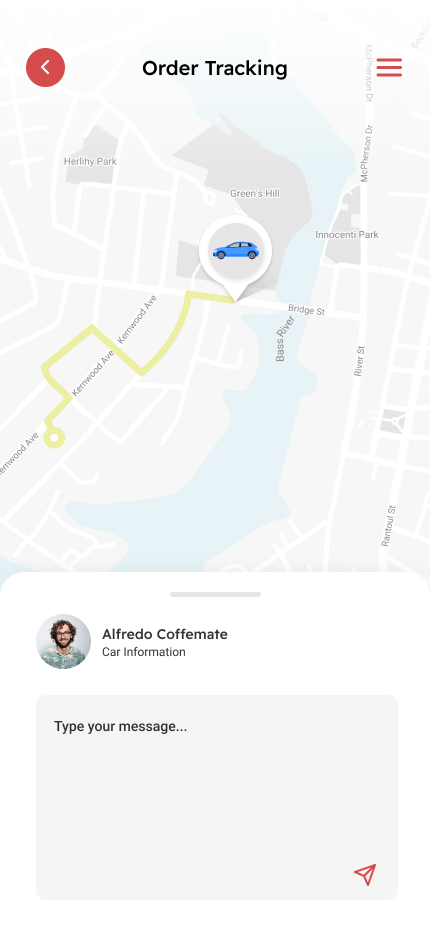
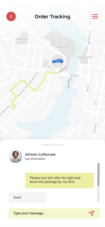
Order Received
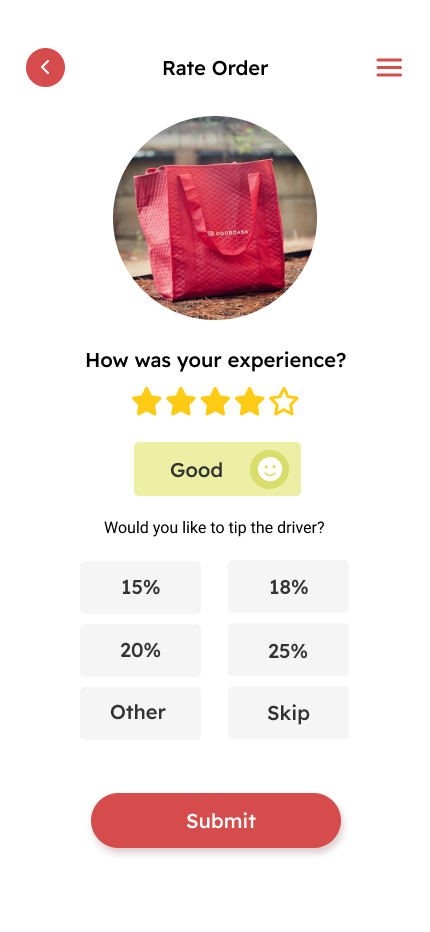
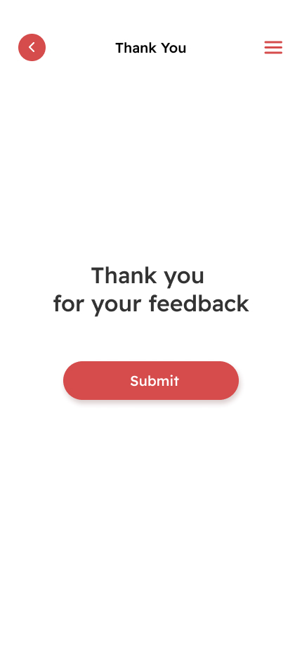
Order Modification
Accessibility considerations
Color and Contrast
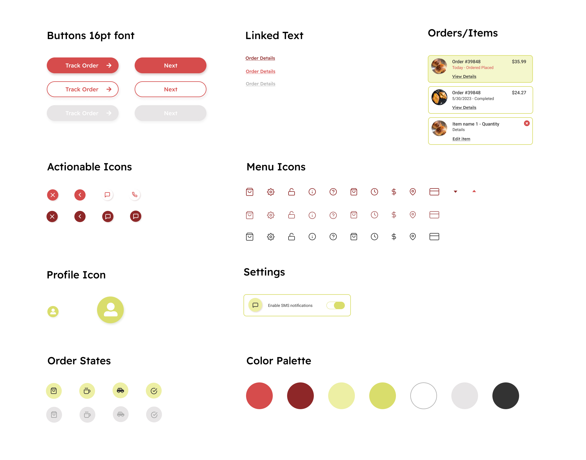
I’ve selected a color palette that not only aligns with our brand identity but also provides sufficient contrast for users with varying degrees of visual perception. All text and interactive elements are clearly distinguishable against their background colors, ensuring readability for all users, including those with color vision deficiencies.
Text Size and Font
This app uses sufficiently large text size and legible fonts, accommodating users with a range of visual acuities. Additionally, I’ve ensured compatibility with device settings that allow users to further adjust text size according to their preference.
Touch Targets
To accommodate users with motor control challenges, I’ve designed our touch targets (buttons, swipes, etc.) to be large enough and spaced appropriately. This allows accurate and comfortable interaction with the app’s functions, regardless of the user’s mobility level.
Takeaways
Throughout this project, I learned the critical importance of a user-centric approach to design, beginning with thorough research to understand our target users’ needs and behaviors. Empathizing with users was key, as it allowed me to design a delivery tracking feature that truly resonates with their requirements and expectations. The focus on accessibility ensured that our feature is usable by a diverse audience, reinforcing the principle that good design is inclusive design. Lastly, usability testing was instrumental in refining the design, highlighting areas of improvement that could have been easily overlooked. Overall, the project was a comprehensive lesson in marrying functionality, aesthetics, and user comfort in UX design.
